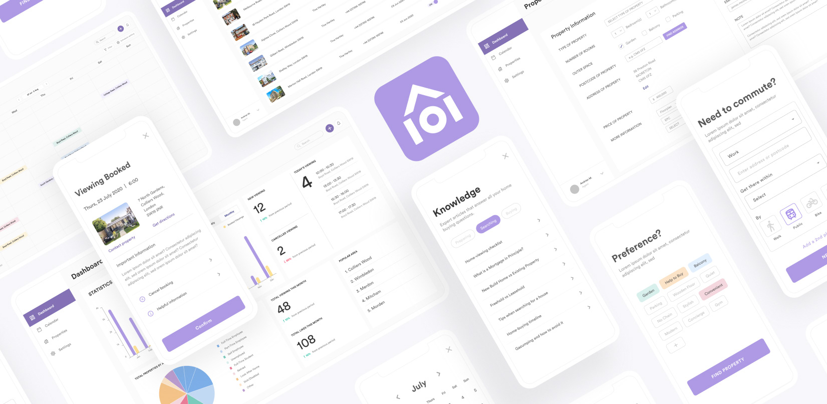
Home101
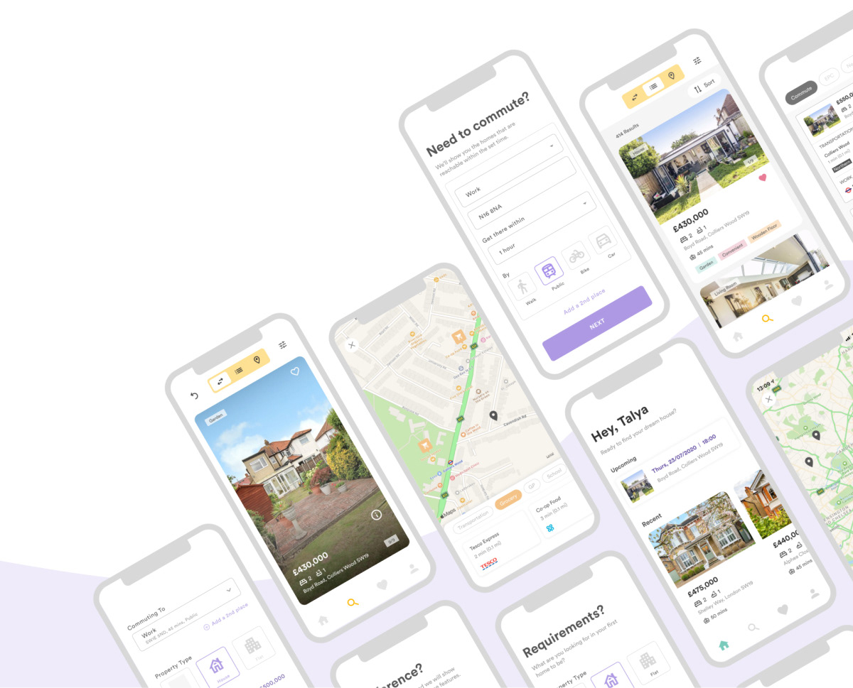
Property Searching App
Home101 helps users to get all the information about the property and to have more easy and fun experience while searching for their first dream house.
YEAR DELIVERABLES SOFTWARE
2020 UI/UX FIGMA
1. OVERVIEW
CHALLENGE
• Finding a perfect property is very hard and stressful
• Many information is not in one place
• How properties are shown is not identical
• Each process takes too long
"How might we improve the experience for users to enjoy the process of finding their dream house?"
SOLUTION
• Provide more detailed filtering system
• Availability for viewing booking system
• Organised and identical format for every properties
• Less stress and more excitement
2. KEY FEATURES
01
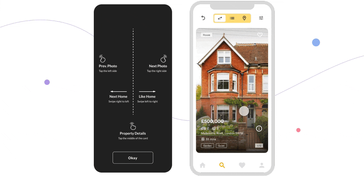
More fun and engaging interactions
Finding a property with more interactions is more exciting than just with one endless scroll.
02
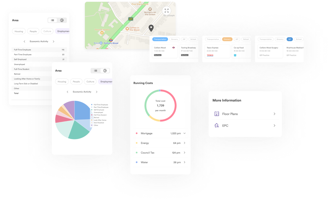
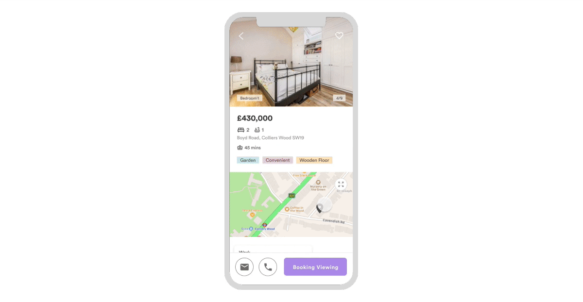
Find out everything about the property from the app
All the information you might want to know about the property is in the app including the property itself, transportation, commuting and the area and neighbor around the property.
03
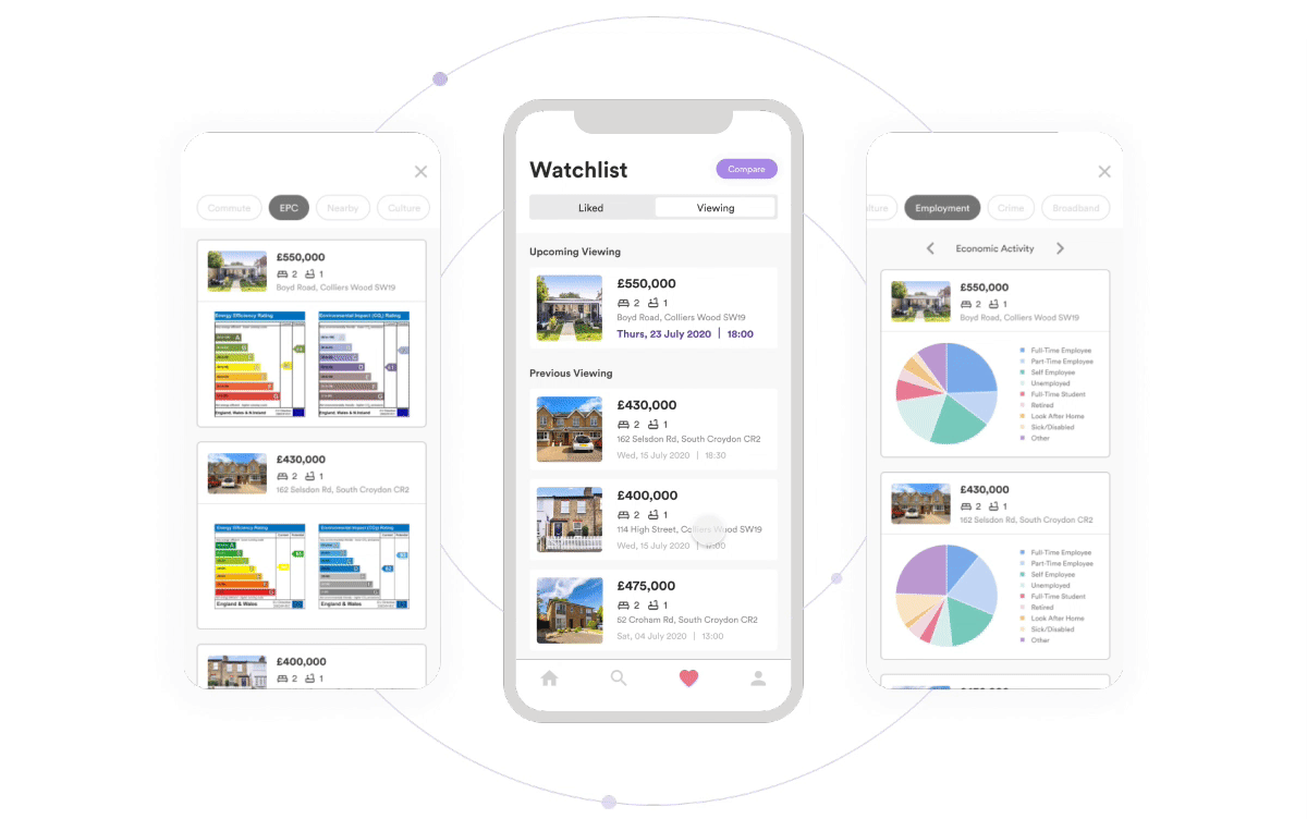
Compare the properties that you are interested in
Amongst the properties you are interested in, compare them in many different aspects to help you choose a better home for you.
04
Book a viewing without contacting the agent
Select the date and book for a viewing instantly will save you a lot of time. No need to wait for the agent to get back to you.
3. PROCESS
3-1 DEFINE
"How might we improve the experience for users to enjoy the process of finding their dream house?"
3-2 RESEARCH
Secondary Research
I began my initial research by exploring various potential areas of opportunity, notes and sources surrounding the areas of property searching. I identified a few early areas of opportunity within : excitement of finding the first home without taking too long and with a helpful guide.
I identified a few early areas of opportunity within : excitement of finding the first home without taking too long and with a helpful guide.
- Changing the perspective of property hunting. “Why is it so hard to buy a house?” “Why is house buying so stressful?” It should be exciting, not stressful.
- Availability to gather the information as much as needed within the same platform instead of searching for information individually.
- It takes too long to buy the property. There are too many steps.
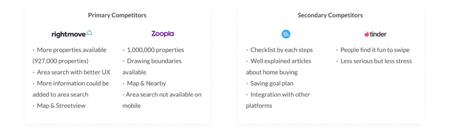
Competitor Analysis
I began my initial research by exploring various potential areas of opportunity, notes and sources surrounding the areas of property searching.
Primary Research
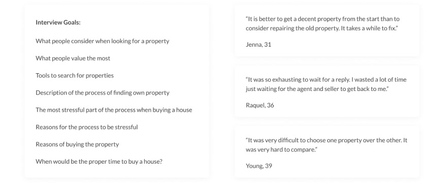
In conjunction with my secondary research, I interviewed a total of 16 different people from the age ranges of 25 to 44 years old uncover unmet needs, desires and frustrations regarding my topic. In order to help guide my interview protocols, I identified a few overarching goals on what I wanted to discover through my research.
Affinitisation
After conducting secondary and primary research, I had generated a substantial amount of data points to synthesise. The general insights extrapolated from these data points helped guide my direction for the next steps towards ideation.
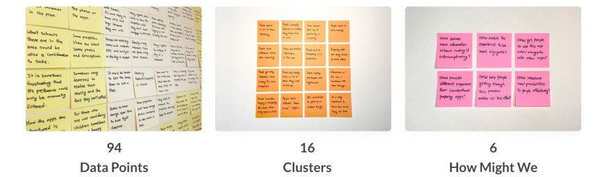
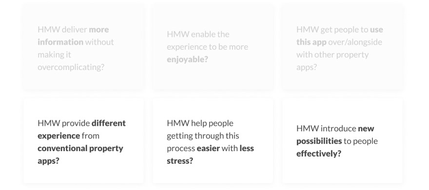
From these 94 data points, I grouped these into 16 different orange sticky notes, each with a general statement encompassing the group’s overarching insight. From these clusters, I once again grouped them into 6 and generated a How Might We (HMW) statement. I decided to focus on three:
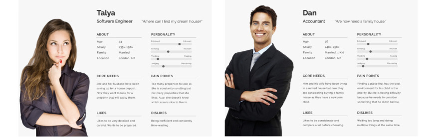
Persona
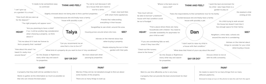
Empathy Map
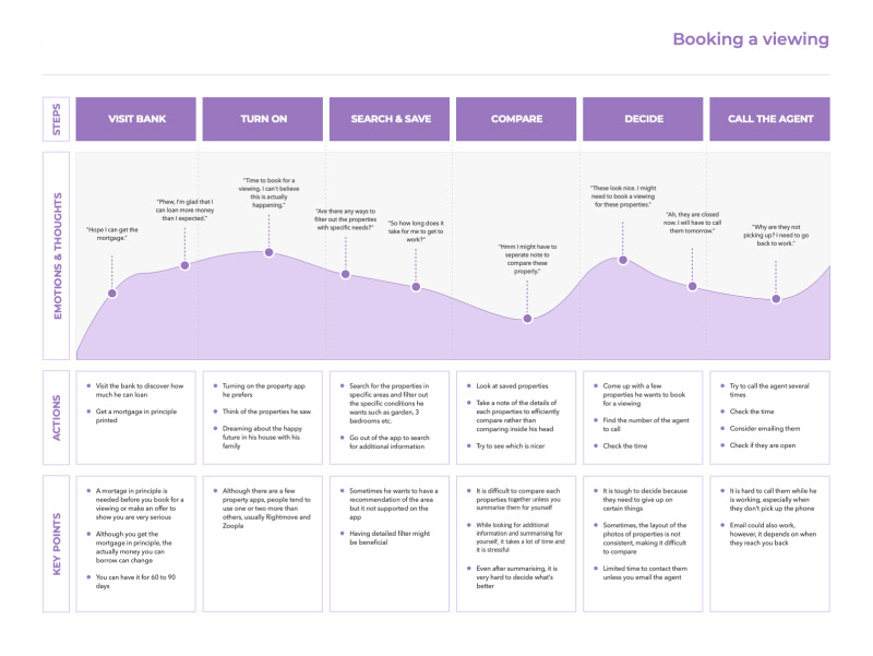
User Journey Map
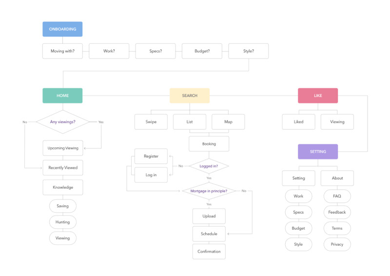
Information Architecture
After a rough sitemap for our concept, I began to create basic structures for this app.
3-3 IDEATE
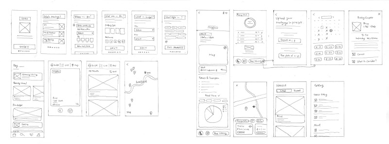
3-4 PROTOTYPE
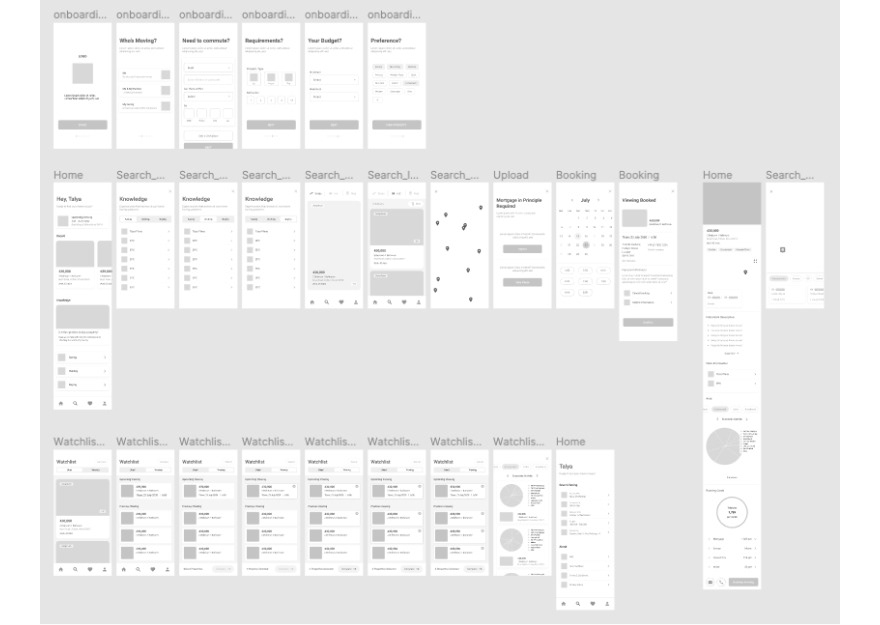
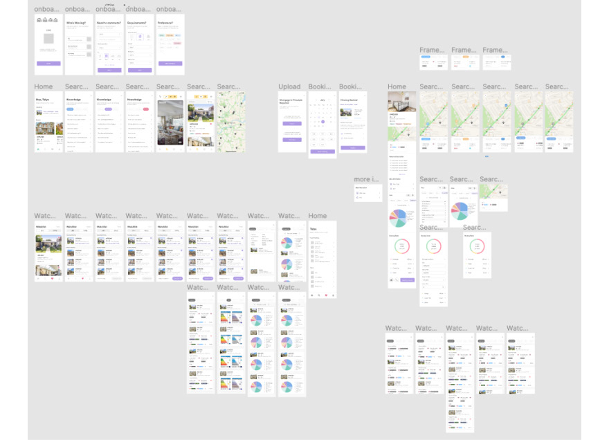
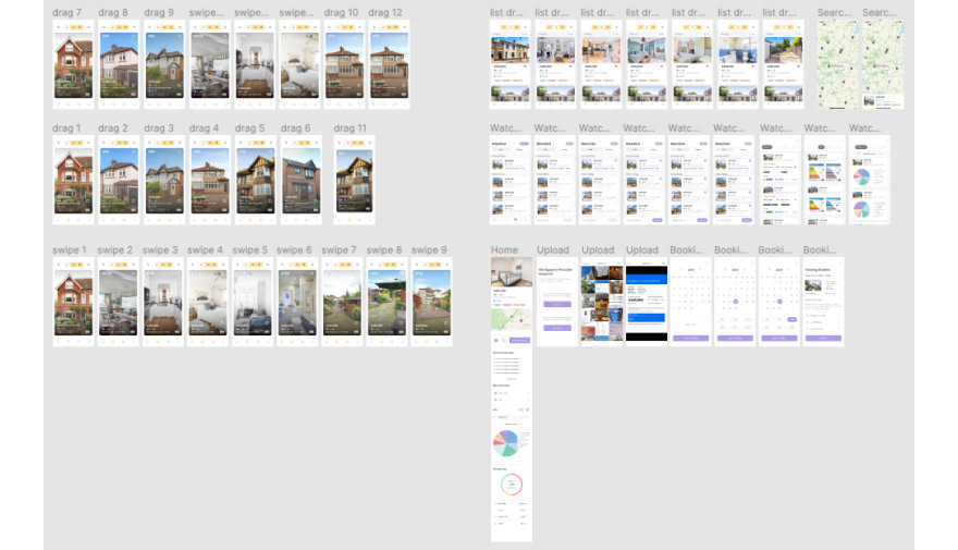
3-5 ITERATION
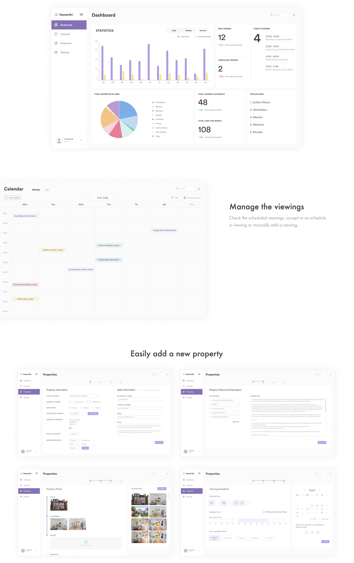
Dashboard
Web app for agents to manage appointments and properties as well as to check the analytics, such as total views and booked viewings of uploaded properties for any period.
4. REFLECTION
It was the first project to consider two different user groups: home buyers and agents. I was able to learn that different things need to be considered for this type of products, and that I need to fully understand their different needs.
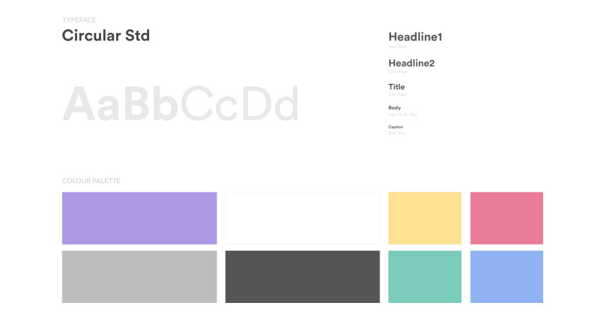
I got a feedback from a UI Designer saying try to consider accessibility more. At the moment, my main colour's hex code is AB9CE0, which has 2.45:1 contrast ratio. This is quite low contrast ratio so in this case, sometimes it can cause difficulty for visually impaired users to identify buttons with this colour.
In the future, it would be useful for me to consider more accessibility in order to reduce potential difficulties for users.